Which method should you use?
All three produce a Gantt chart you can present. The difference is how long it takes and how painful the next update will be.
| Method | Best for | First chart | Each update |
|---|---|---|---|
| 1. Stacked bar chart | A one-off chart with a handful of tasks | 20–30 min | Edit the data by hand |
| 2. Free template | A clean look without building from scratch | 10–20 min | Move bars by hand |
| 3. GanttSnap add-in | Recurring reports and real project schedules | Under a minute | Import and redraw |
Method 1: Build a Gantt chart from a stacked bar chart
This is the classic do-it-yourself approach. A stacked bar chart has two series per task: an invisible one that pushes each bar to its start date, and a visible one whose length is the duration.
-
Insert a stacked bar chart
Go to Insert → Chart → Bar → Stacked Bar and click OK. PowerPoint opens a small Excel sheet with sample data.
-
Enter your tasks
Put task names in column A, start dates in column B and durations in days in column C. Delete the sample column D and any extra rows.
-
Hide the start series
Click the first set of bars, open Format Data Series, and set Fill → No fill and Border → No line. What's left looks like a Gantt chart.
-
Put the first task at the top
Bar charts list categories bottom-up. Select the vertical axis, open Format Axis and tick Categories in reverse order.
-
Set the timeline range
Select the horizontal axis and set its Minimum and Maximum bounds to your project start and end, so the chart doesn't start at the year 1900. If the box won't accept a date, use the date's serial number (format the date cell in Excel as Number to see it).
-
Tidy it up
Delete the legend and chart title, reduce the Gap Width to around 50% for thicker bars, lighten the gridlines and pick a colour.
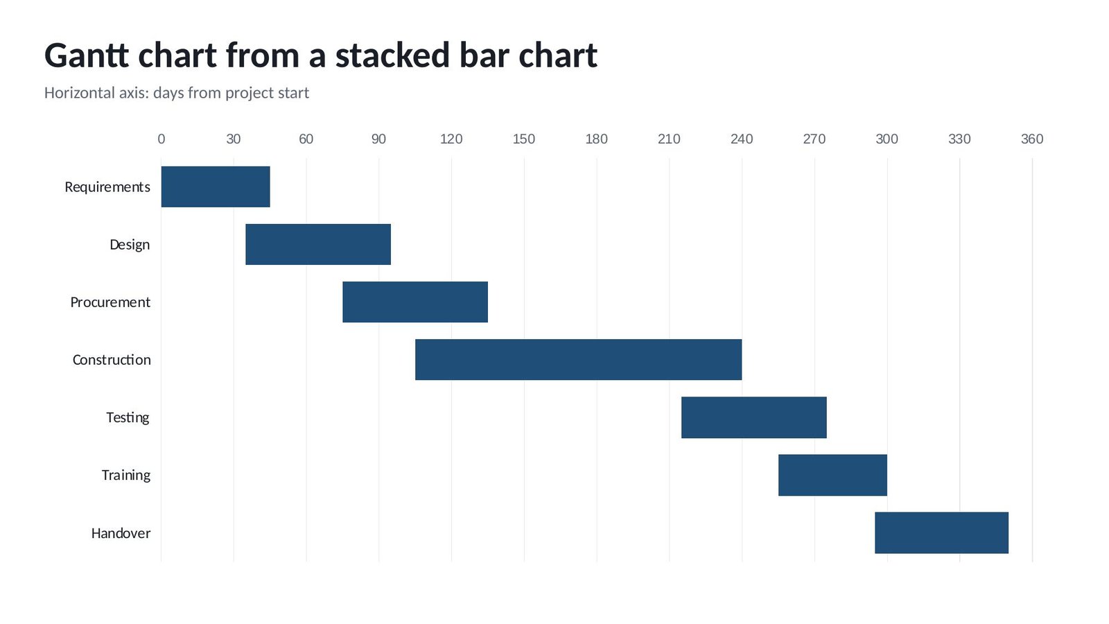
Good for: a quick, one-off chart. Watch out for: there are no milestones, no phases and no today line without extra work, and every change means editing the data behind the chart.
Method 2: Start from a free Gantt chart template
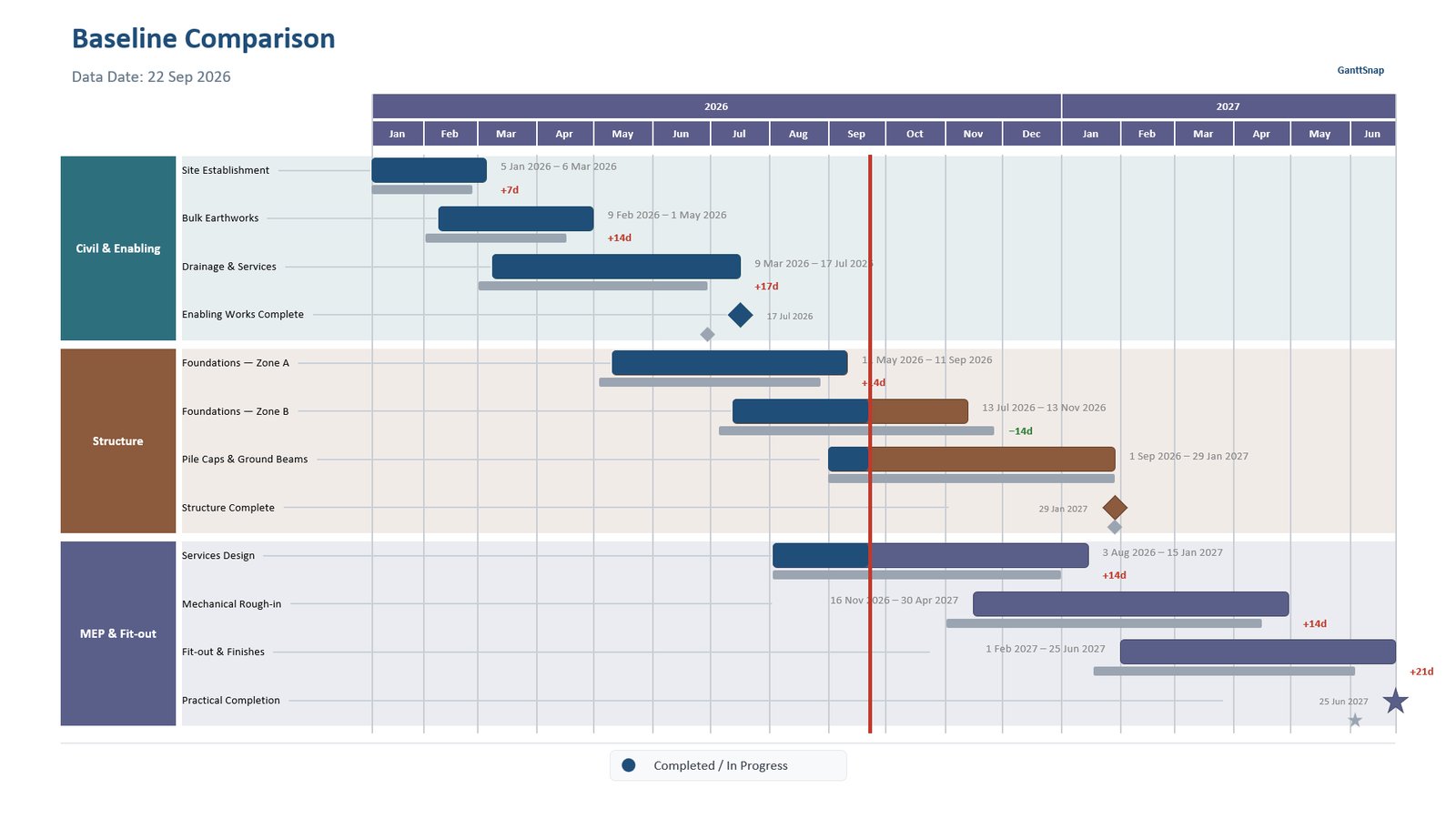
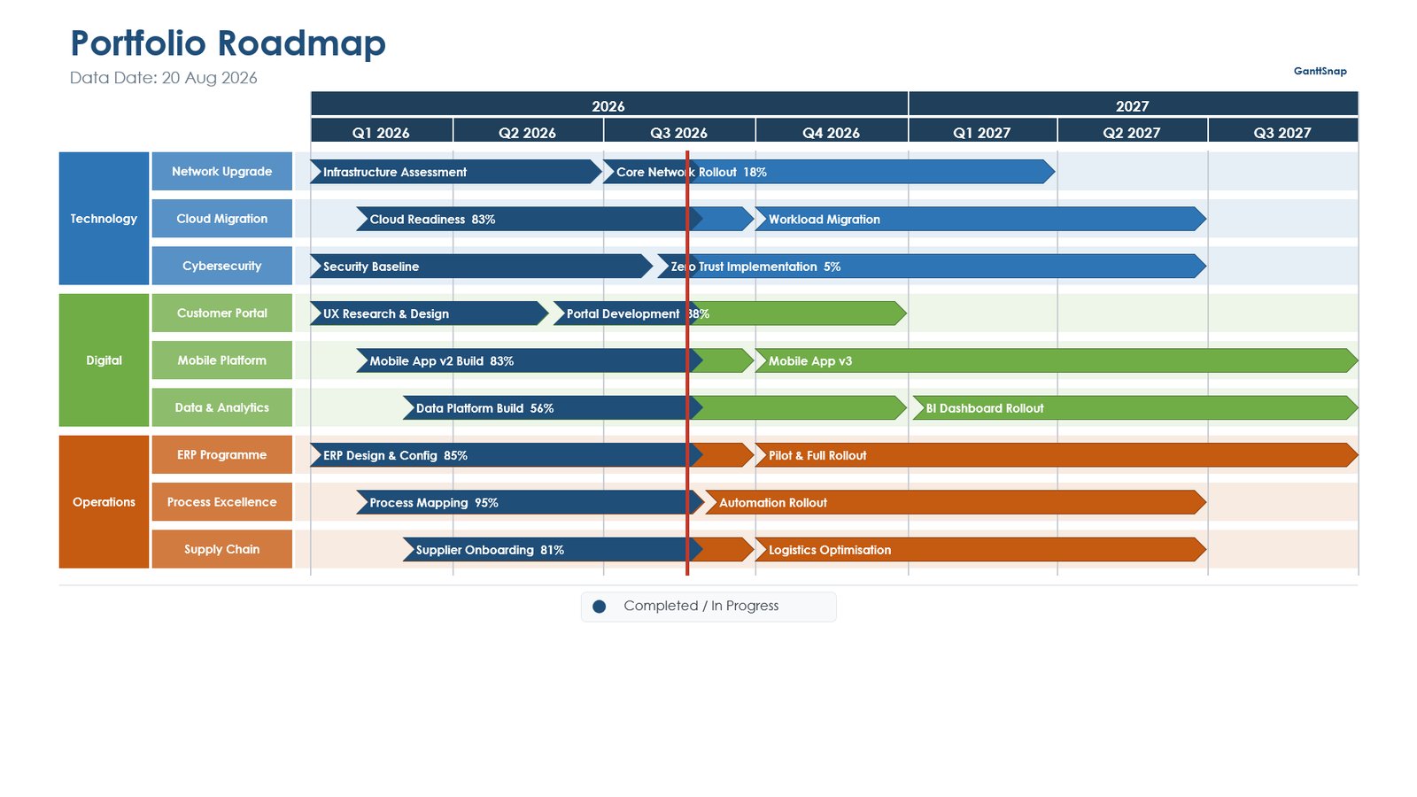
A template gives you a finished design to fill in. Ours was drawn with GanttSnap from sample project data, and it is made of ordinary PowerPoint shapes rather than a chart, so every bar, label and milestone can be dragged, resized and recoloured directly on the slide.
The download contains three slides:
Executive Overview
Phases as colour-coded swimlanes, task bars with progress, milestones and a data date line.
Baseline Comparison
Current bars over grey baseline bars, with the finish slip in days, red for late and green for early.
Portfolio Roadmap
Programmes and workstreams in two levels of swimlanes, with chevron bars and percent complete.
How to edit the template
- Type over task, milestone and swimlane labels to rename them.
- Drag a bar's ends to change its dates, using the month gridlines as a guide, and update its date label.
- Recolour a swimlane by selecting its bars and changing the shape fill.
- Move the red data date line to your status date each reporting period.
Good for: a professional-looking chart without building from scratch. Watch out for: the dates are not linked to anything, so every schedule update means moving bars by hand.
Method 3: Generate it automatically with GanttSnap
If you present a schedule more than once, updating bars by hand gets old quickly. GanttSnap is a PowerPoint add-in that draws the Gantt chart for you from your schedule data, as native, editable PowerPoint shapes.
-
Install GanttSnap
Add it free from Microsoft Marketplace, or in PowerPoint via Home → Add-ins. See the install guide.
-
Add your schedule
Import an Excel file or type tasks into the built-in table. On the Advanced plan you can import Primavera P6 XER and MS Project XML files directly.
-
Pick a template
Choose a layout for your audience: executive summary, detailed schedule report, milestone plan, roadmap or baseline comparison.
-
Draw
GanttSnap draws the slide in seconds, including swimlanes, milestones, progress and logic links. When the schedule changes, import again and redraw. Only GanttSnap's own shapes are replaced.
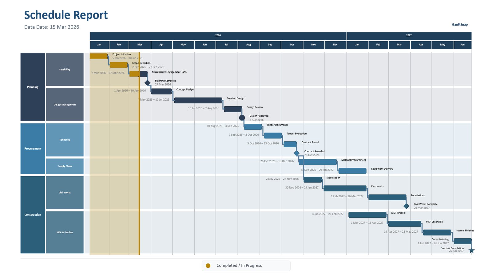
More layouts GanttSnap draws
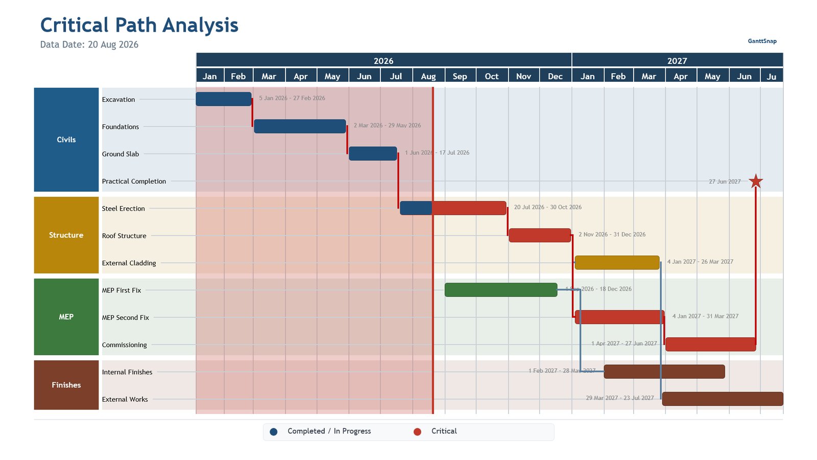
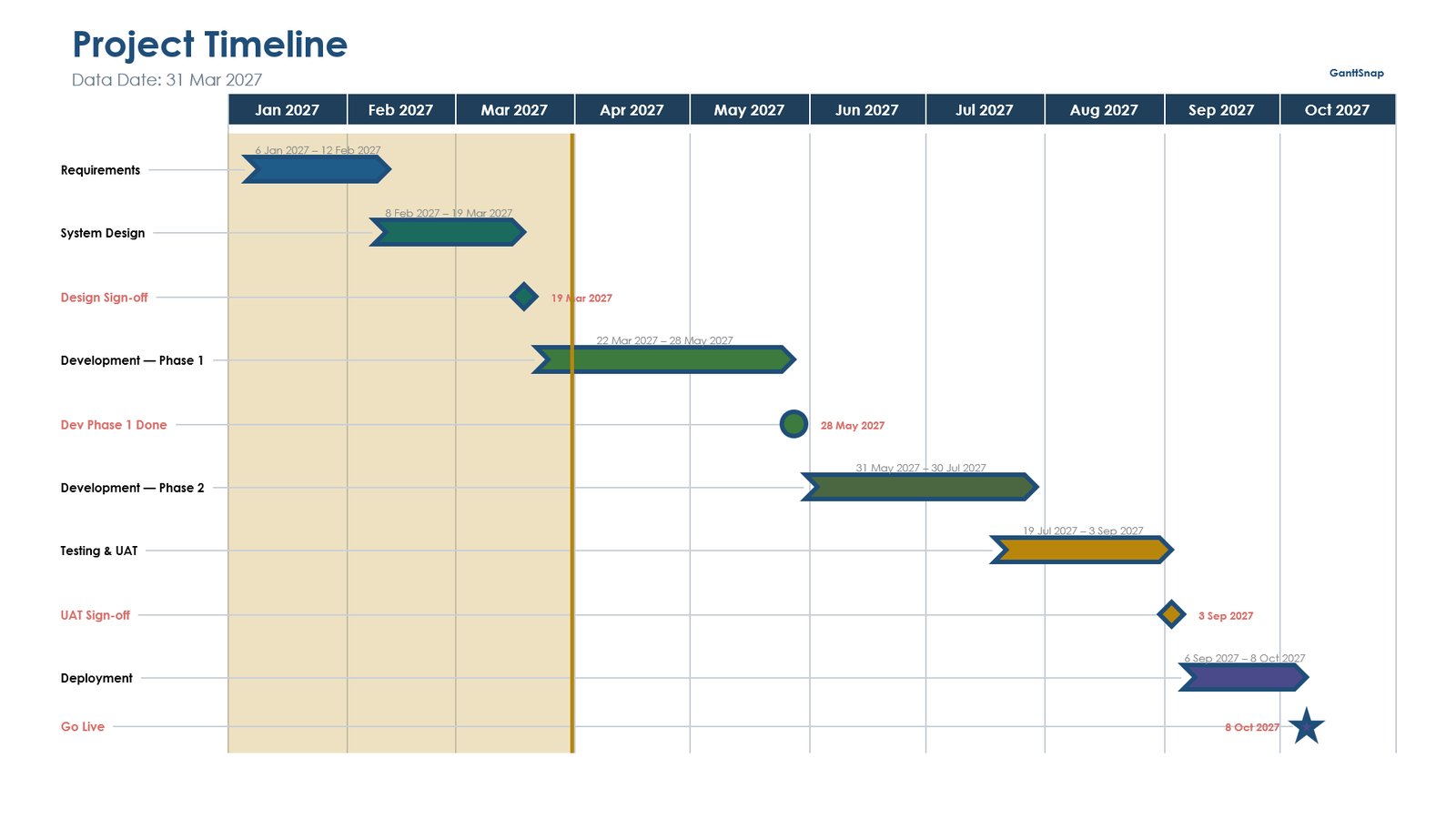
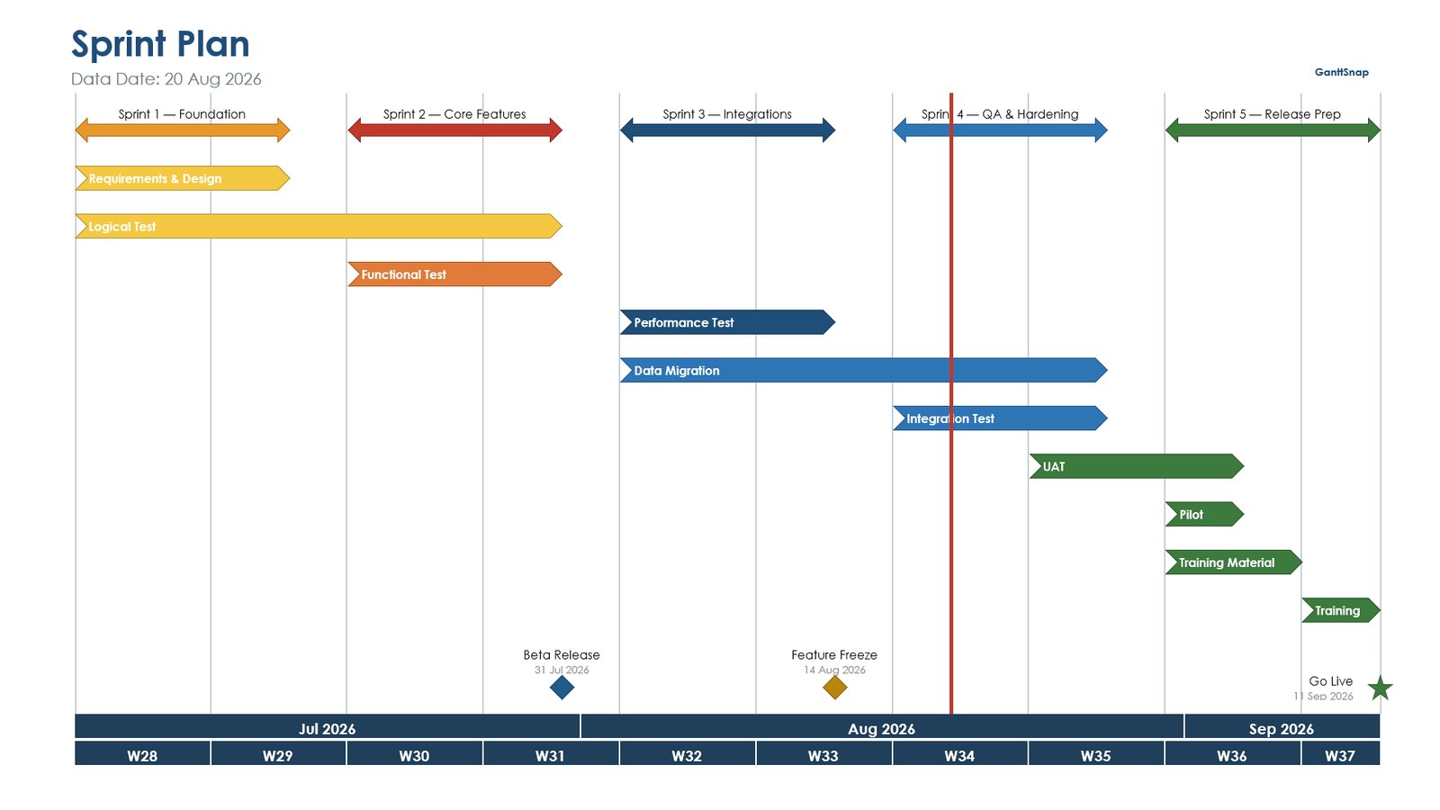
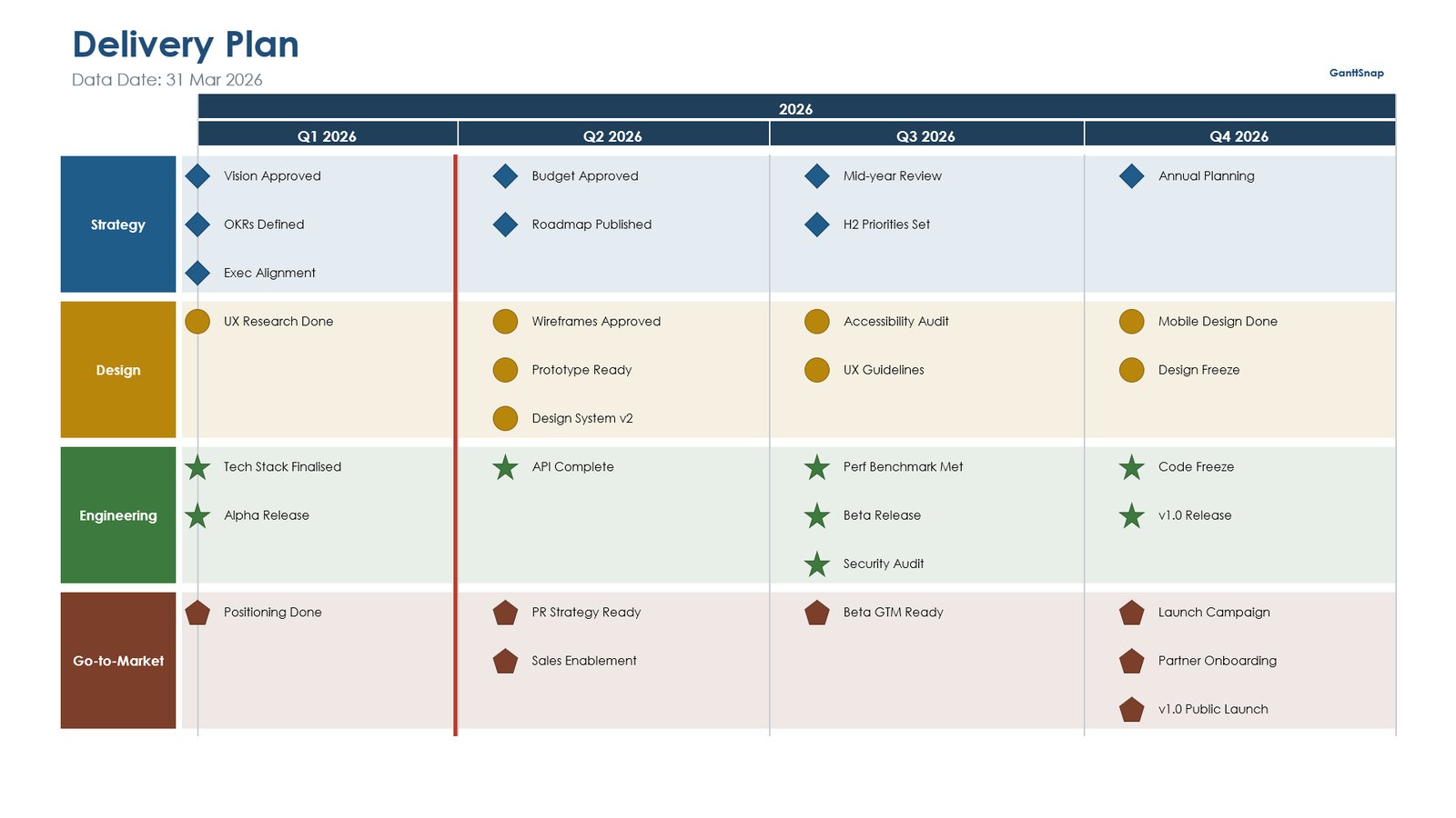
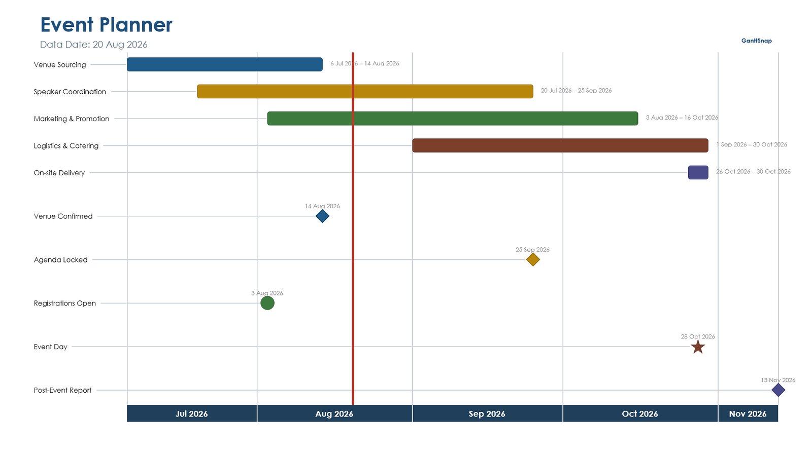
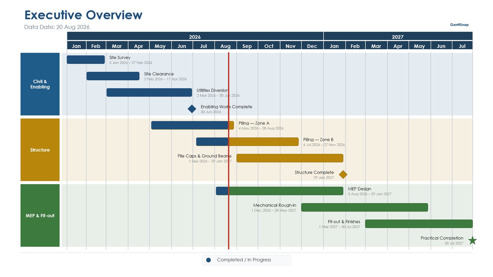
Good for: monthly reports, steering committees and anyone whose schedule lives in Excel, P6 or MS Project. The free Starter plan covers Excel import for up to 10 activities. See plans.
Tips for a Gantt chart people can actually read
- Keep it to 15–20 rows. Roll detail up into summary bars; the full schedule belongs in an appendix, not on the slide.
- Show the milestones. Decision makers remember dates, not bars.
- Mark today. A today or data date line instantly shows what should already be done.
- Use colour for meaning. Colour by phase or status, never just for decoration.
- Show slippage when it matters. A baseline comparison makes delays visible instead of implied.
- Check the schedule first. For P6 schedules, a DCMA 14-point assessment catches missing logic and unrealistic float before anyone else does.
Frequently asked questions
Does PowerPoint have a built-in Gantt chart?
No. PowerPoint has no dedicated Gantt chart type. You can build one from a stacked bar chart, use a template, or use an add-in such as GanttSnap that draws it for you.
Can I make a Gantt chart in PowerPoint from Excel data?
Yes. You can paste your data into a stacked bar chart (Method 1), or import the Excel file into GanttSnap, which draws the chart automatically. Excel import is available on every GanttSnap plan, including the free one.
Is the Gantt chart template really free?
Yes. It's a free download with no sign-up, and you can use and edit it for any project.
Does the template work in Google Slides?
Yes. The slides are made of ordinary shapes, so they open and can be edited in Google Slides, although fonts and some shapes may look slightly different.
How do I keep a PowerPoint Gantt chart up to date?
With a manual chart or template you move bars by hand after each schedule update. With GanttSnap you import the updated schedule and redraw, and the slide matches the data again in seconds.